Simplifying Customer Service at Glidewell
Enterprise UX · Information Architecture
CLIENT
Lead Designer
COMPANY
Glidewell
Overview
GCX is Glidewell's internal customer relationship management platform, used by customer service representatives to access customer information and support their day-to-day work.
I worked on improving the experience by identifying pain points in existing workflows and redesigning key areas of the platform to make information easier to find, understand, and act on. My work spanned user research, information architecture, interaction design, prototyping, and testing.
The goal was to create a more intuitive and efficient experience for the 100+ employees using GCX while establishing clearer patterns that could support the product as it evolved.
GCX is Glidewell's internal customer relationship management platform, used by customer service representatives to access customer information and support their day-to-day work.
I worked on improving the experience by identifying pain points in existing workflows and redesigning key areas of the platform to make information easier to find, understand, and act on. My work spanned user research, information architecture, interaction design, prototyping, and testing.
The goal was to create a more intuitive and efficient experience for the 100+ employees using GCX while establishing clearer patterns that could support the product as it evolved.

Understanding the Work
Before redesigning GCX, my team and I looked at how customer service representatives completed common tasks and where the existing experience created confusion.
Through interviews, workflow analysis, and card sorting, we found that the challenge wasn't simply the number of tasks available. It was how those tasks were organized and where users expected to find them.
What we learned
01 — Tasks were difficult to locate
CSRs weren't always sure where common actions lived. Even something as straightforward as changing a customer's billing address could be difficult to find.
02 — Different tasks needed different experiences
Some actions were quick and direct, while others required multiple steps and more information. Treating them all the same added unnecessary complexity.
03 — Case information wasn't where users expected it
CSRs struggled to quickly locate case-specific information, including prescriptions and photos, while assisting customers.
The opportunity wasn't to add more functionality. It was to make the functionality already there easier to understand and find.
Before redesigning GCX, my team and I looked at how customer service representatives completed common tasks and where the existing experience created confusion.
Through interviews, workflow analysis, and card sorting, we found that the challenge wasn't simply the number of tasks available. It was how those tasks were organized and where users expected to find them.
What we learned
01 — Tasks were difficult to locate
CSRs weren't always sure where common actions lived. Even something as straightforward as changing a customer's billing address could be difficult to find.
02 — Different tasks needed different experiences
Some actions were quick and direct, while others required multiple steps and more information. Treating them all the same added unnecessary complexity.
03 — Case information wasn't where users expected it
CSRs struggled to quickly locate case-specific information, including prescriptions and photos, while assisting customers.
The opportunity wasn't to add more functionality. It was to make the functionality already there easier to understand and find.

Finding the Right Structure
Our research showed that simply having all available tasks in one place wasn't enough. CSRs needed a clearer way to understand where an action belonged and where to look for it.
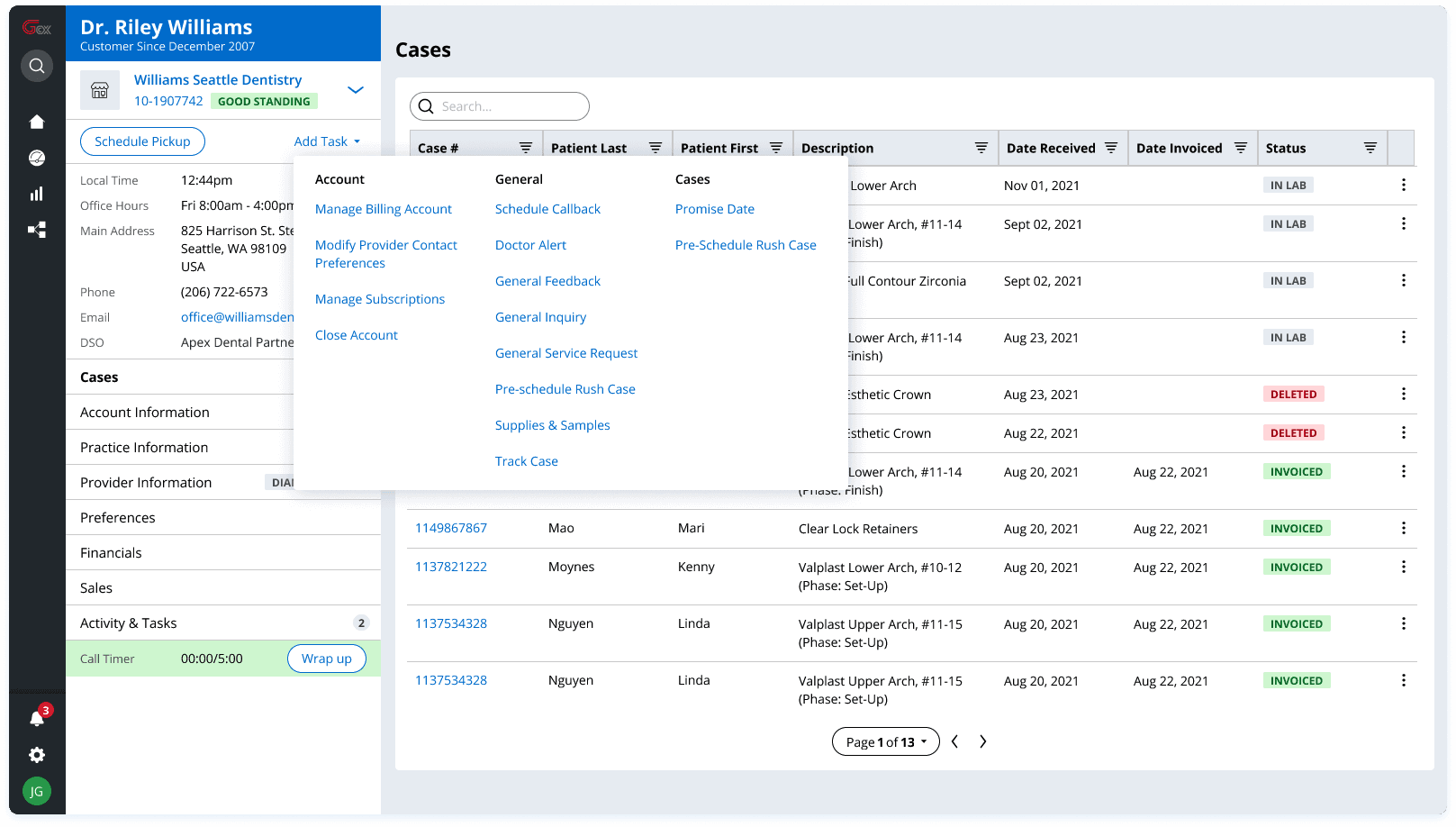
Using insights from card sorting and workflow analysis, my team and I grouped related tasks and consolidated overlapping actions. We organized the task navigation around three clearer levels—Account, General, and Cases—and moved case-specific actions closer to the information they affected.
The goal was to make GCX more self-explanatory and reduce the amount of searching required to complete everyday work.
Rather than asking CSRs to learn where the system stored each task, we reorganized GCX around where they naturally expected to find it.
01 / Grouping related tasks
Instead of presenting CSRs with a long list of individual actions, we grouped related tasks based on patterns we identified through card sorting.
The shift:
Scattered tasks → Clear, predictable categories
02 / Putting actions where users expect them
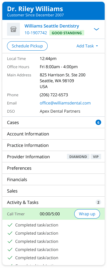
Research showed that even simple tasks, like changing a billing address, could be difficult to locate. We moved Account, Practice, and Provider information out of the general task menu and into the 360 panel as dedicated tabs.
Case-specific actions were similarly moved closer to the case itself rather than competing for space in the global navigation.
The shift:
“Where is this task?” → Actions within their relevant context
Our research showed that simply having all available tasks in one place wasn't enough. CSRs needed a clearer way to understand where an action belonged and where to look for it.
Using insights from card sorting and workflow analysis, my team and I grouped related tasks and consolidated overlapping actions. We organized the task navigation around three clearer levels—Account, General, and Cases—and moved case-specific actions closer to the information they affected.
The goal was to make GCX more self-explanatory and reduce the amount of searching required to complete everyday work.
Rather than asking CSRs to learn where the system stored each task, we reorganized GCX around where they naturally expected to find it.
01 / Grouping related tasks
Instead of presenting CSRs with a long list of individual actions, we grouped related tasks based on patterns we identified through card sorting.
The shift:
Scattered tasks → Clear, predictable categories
02 / Putting actions where users expect them
Research showed that even simple tasks, like changing a billing address, could be difficult to locate. We moved Account, Practice, and Provider information out of the general task menu and into the 360 panel as dedicated tabs.
Case-specific actions were similarly moved closer to the case itself rather than competing for space in the global navigation.
The shift:
“Where is this task?” → Actions within their relevant context
Redesigning the Experience
With the new structure in place, the next challenge was translating it into an interface that could support very different types of customer service work.
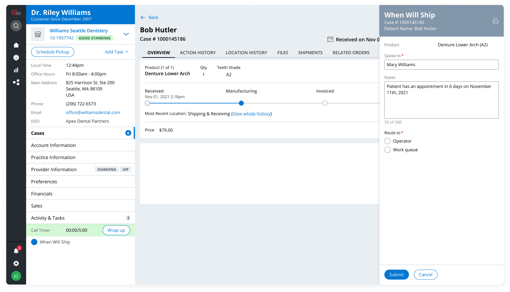
Rather than forcing every task into the same experience, we created flexible patterns based on how much information and attention a task required.
Before: CSRs told us that finding case-specific files, like prescriptions and photos could be frustrating, especially while helping a customer. Attachments were separated from the case information CSRs were already working with.

After: Files were brought directly into Case Details, with file type and uploader information visible at a glance. The redesigned experience brought information and actions closer to the work they supported, helping CSRs stay oriented instead of searching across GCX.
With the new structure in place, the next challenge was translating it into an interface that could support very different types of customer service work.
Rather than forcing every task into the same experience, we created flexible patterns based on how much information and attention a task required.
Before: CSRs told us that finding case-specific files, like prescriptions and photos could be frustrating, especially while helping a customer. Attachments were separated from the case information CSRs were already working with.
After: Files were brought directly into Case Details, with file type and uploader information visible at a glance. The redesigned experience brought information and actions closer to the work they supported, helping CSRs stay oriented instead of searching across GCX.
Design System
GCX was built using Pega Cosmos, a design system for enterprise applications. Rather than designing each workflow from scratch, we used established patterns to create familiar, consistent interactions across the CRM.
As new needs emerged, I also contributed patterns and maintained our Figma component library, helping ensure the designs stayed aligned as the product evolved. Patterns like the side-panel and full-page task experiences gave us reusable ways to support different workflows without reinventing the experience each time.
This helped us design and prototype faster while creating a more consistent, predictable experience for CSRs.
GCX was built using Pega Cosmos, a design system for enterprise applications. Rather than designing each workflow from scratch, we used established patterns to create familiar, consistent interactions across the CRM.
As new needs emerged, I also contributed patterns and maintained our Figma component library, helping ensure the designs stayed aligned as the product evolved. Patterns like the side-panel and full-page task experiences gave us reusable ways to support different workflows without reinventing the experience each time.
This helped us design and prototype faster while creating a more consistent, predictable experience for CSRs.

Testing & Refining
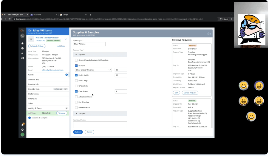
We tested GCX with customer service representatives and technical advisors using role-based scenarios that reflected real customer calls. Rather than testing individual screens, we wanted to see whether users could navigate the new structure and complete tasks in context.
Testing validated parts of the new experience, but also uncovered areas where our assumptions didn't hold up.
What we learned
The new experience felt simpler
Participants responded positively to the cleaner interface and more streamlined experience.
Our terminology was still creating confusion
3 of 7 CSRs couldn't clearly distinguish between Account, Provider, and Practice, and some selected Account Information when they actually needed Provider Information.
Closed accounts needed a different experience
Testing also surfaced confusion around what actions should be available when an account was closed. We refined the experience so unavailable tasks were disabled, while Reopen Account remained actionable.
We tested GCX with customer service representatives and technical advisors using role-based scenarios that reflected real customer calls. Rather than testing individual screens, we wanted to see whether users could navigate the new structure and complete tasks in context.
Testing validated parts of the new experience, but also uncovered areas where our assumptions didn't hold up.
What we learned
The new experience felt simpler
Participants responded positively to the cleaner interface and more streamlined experience.
Our terminology was still creating confusion
3 of 7 CSRs couldn't clearly distinguish between Account, Provider, and Practice, and some selected Account Information when they actually needed Provider Information.
Closed accounts needed a different experience
Testing also surfaced confusion around what actions should be available when an account was closed. We refined the experience so unavailable tasks were disabled, while Reopen Account remained actionable.